Wednesday, 30 May 2012

Some roof experimentation

The geodesic roof was doing my head in!!!!! So I decided to have a go at physically modelling it.
A giant jungle gym!!!

View from the side.

View from the top. 

A view from inside.

Another view from inside.

A close up of the connection, looking straight up. 

Yet another view from inside. 
It is very vibrant, but that was more to do with the fact that I found coloured matchsticks and couldn't be bothered finding boring coloured ones! To create this structure, I started by making triangles. I chose triangles over pentagons or hexagons (such as were in Buckminster Fuller's plans) as they were the easiest to construct. I hot glued each corner, and then hot glued the triangles together. As I was placing them, the arranged into hexagons and pentagons, and started to fold and rise in an awesome way! I really like the model, I think it is very tactile (for all the fact that it looks like a Grade 3 student made it!!!!) and very vibrant. The next challenge is to model it on the computer. Yuk.

Sunday, 27 May 2012

Updating the Building

Considering the need to get sunlight into the building, it was (as previously discussed) important to include a glass roof, and a geodesic one at that. So building up on my previous sections and elevations, I decided to update the building to include the new roof.
This is the front elevation. It shows the roof as it comes up from the front of the building. It is also important to incorporate some glazing into the top floor's walls. Considering the fact that I wish the top exhibition room to capture the 'sound of the city' there will have to be another glass roof between the internal walls, that I have not considered in this image.
 This is the side elevation, again, the ground comes up to the walls on the bottom floor, allowing areas to play underneath the building.
This is a section from the side. In addition to the new roof (which has necessitated the modification of  some of the walls on the top floor), I have considered the fact that the Biospace needs to have a contained soil environment. Without significant (and expensive!!!) testing, I would not use the soil on site. Who knows what's in it?! There could be heavy metals, the soil could be acid-sulfate (actually quite likely considering its proximity to the river...) and all sorts of things left over from its previous land uses. A contained environment is going to work much better.
Another section, this time through the front of the building. This gives and idea of the staircases etc and the way people can move though the building. It still needs a lot of work, and I am going to give it a go in Revit...

Tuesday, 22 May 2012

Design inspiration - Geodesic Domes/Roofs

Well, I didn't really want to have a glass roof, but considering the existence of living things within the building, it really is a necessity. There are ways to do it quite attractively, and the first thing I thought of was a geodesic structure.
I was very inspired by the Grand Designs episode that showcased the Dome House overlooking Lake Windermere (I'm going there at the end of the year :D :D :D). Although it did not go completely according to plan, the end result was quite beautiful.
This first image gives just a glimpse of the geodesic roof structure.

This is a better image of the complex geodesic design.

This is the exterior of the house.
Considering many of the "Biospheres" I have seen during my research, the majority are geodesic domes.

I also thought about the British Museum's roof over the Great Courtyard... this is a geodesic  structure  that is not a dome. (Again, I am going there at the end of the year :D)
The roof was designed by Norman Foster.
I am thinking that it will be possible to apply this sort of thing to my building, in order to get enough light in. I think that I may need to complement it with some reflective surfaces on the inside in order to bounce the light into the far corners and the base.


Each of these are Buckminster Fuller's patents. They are really interesting and very cool!

I found some of these technical drawings of Buckminster Fuller's. He seemed to be very intent on creating new ways of building... with geodesic structures. I'm a little sad that his Dome houses never took off. Actually, I have always thought of a structure like this made out of solar panels... could generate and store all the energy it needed. But that is an aside. 


Saturday, 19 May 2012

Solar Study

In order to determine how my building would perform on the site, I built a mass in sketchup and also built the surrounds, namely the bridge and the cliffs. I considered these to be determining factors in the light on site.
I initially had considered this area to be optimimum for my building:
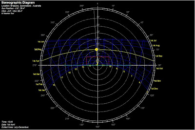
This is the Stereographic diagram for Brisbane as generated off Ecotect's Weather tool.


So I decided to make my first solar study with the building in that section of the site. This is March 23, 8.00 am. The eastern facade of the building is receiving light, as would be expected.
This is March 23, 12.00pm. It can be seen that the top of the building is receiving direct sunlight. However, there is a bridge in the way... so where is the shadow from the bridge? I think this is one of the limitations of Google Sketch-up. Even so, I can still get an idea of the intensity  and the position of the sun and the shadows on the building.

This is March 23, 4.00pm. By the looks of things most of the eastern side of the building is in shadow.

This one is June 23, 8.00am. By comparision with the March example at the same time, it looks as though the sun is less intense on the facade of the building. This would be expected, given that it is winter.

The above is June 23, 12.00pm. The light is significantly less intense on the top of the building than in March.

This one is obviously the June 4.00pm example. Building is significantly in shadow.
This one is September 23 8.00am. Similar to March, but again expected as it is the corresponding time of year on the opposite side of winter.

12.00pm September 23.
4.00pm September 23.

December 23, 8.00am and the sun seems to be casting light on the entirety of the building. Is now the height of summer, so the sun would be higher in the sky, therefore expected.
12.00pm December 23.

4.00pm December 23.
Following this I decided to try moving the building so that it was out of the way of the bridge (not that Google really shows it accurately).
March 23, 8.00am
March 23, 12.00pm

March 23, 4.00pm
June 23, 8.00am

June 23, 12.00pm

June 23, 4.00pm
September 23, 8.00am

September 23, 12.00pm

September 23, 4.00pm
December 23, 8.00am
December 23, 12.00pm
December 23, 4.00pm

These don't take into consideration the entirety of the cliff, or the city which is to the west of the site. If the city was there, there would be a significant difference, particularly in the afternoon shadowing. It is likely that there would be no sun on the site at 4.00pm in reality, as the buildings, suburbs and mountains would clearly be in the way! Perhaps I need to redo my solar study when I construct my building in Revit.

Tutorial Work

In this week's tutorial, I worked on the elevations to make them more realistic, and completed a building section, that aimed to show some of the qualities of the building as described in the narrative. I also had a play with some interior views, again taken from the narrative. I also considered the site and the entry and exit patterns of visitors.
This is the Northern Elevation... and the building as viewed from the front. The shading gives and indication of the possible facade treatment as inspired by my earlier example.

This is the Southern Elevation. It gives a bit of an indication of some possible locations for glazing. Considering the fact that I have living things (plants AND animals) inside my building in a controlled environment, the amount of natural light getting in is essential.

This is the Western Elevation. Again, the use of the facade treatment around the building and an indication of the glazing.

This is a cross section, north to south, through the centre of the building. It gives an indication of each of the spaces, from the tiny entry lobby, to the presentation space looking out towards the Biospace, the platforms that wind up through the Biospace to the top exhibition space in the canopy of the trees. Clearly, there is not enough glazing present to support life. This is something that I need to consider carefully.

This is just a quirky representation of the use of glazing in the top exhibition area to reveal glimpses of the Biospace outside as described in the narrative. Considering the different levels, the children can have a bit of fun looking out. :D

Just an indication of the ramp winding up through the Biospace.

In this image, I am considering how I want people to exit and enter the space. I really wish for there to be a ferry stop underneath/between the Story Bridge pilons. I then considered the fact that not everyone will want to enter via the River (seasick people perhaps?!) which would limit visitors (we CAN'T have that :P). So I considered a boardwalk that comes around to meet the pier. Again, flow could be an issue if the building is that close in proximity to the other buildings.


From here, it was now essential to consider the light entering the site to inform the most efficient placement of the building.