This week we went back to the Howard Smith Wharves site to
gather some more insight into the location of our Folie. We had decided that we
would use the area under the bridge for multiple reasons, some of these being
the fact that it was high enough to resist flooding and had a great view! But
more than that, the site has a unique sound quality to it – something we
recognised on our first visit and something we investigated more on our second.
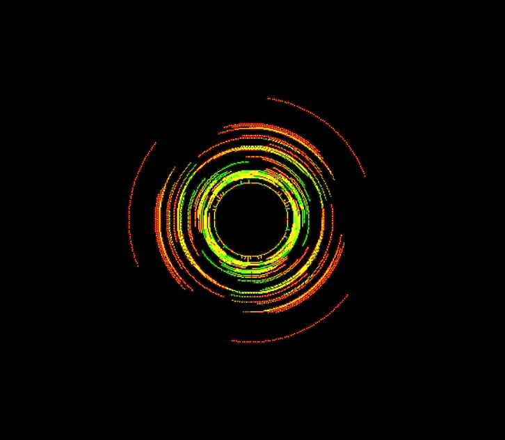
I took multiple sound recordings at the site, and from here
produced visualisations to match the sound patterns (using VLC media player).
This is the ‘Goom’ visualisation pattern. It looks like a
load of colour and is quite hard to make sense of.


This is the ‘Scope’ pattern. This is perhaps the most
recognisable form of sound wave visualisation.


The second last pattern is the ‘Spectrometer’. This pattern
reminds me of ripples in a pond, although the sound that produced it does not
sound anything like a pond!!!

This is the ‘spectrum’ visualisation pattern. This is reasonably self-explanatory: it looks like a blocky wave form, and reminds me of sound as visualised on an old music player my dad had. Perhaps inspiration for the Folie?


From these sound visualisations, I decided to make a few
rough sketches of how sound waves could translate into a Folie. Would the sound
waves inform the form, or the way in
which people interact with the space,
or both?


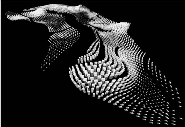
I also decided to search for inspiration on the web. The
following are some results of ‘sound architecture’ and ‘sound art’.


Along with the visualisation of sound, I also produced some
of my own site analysis and looked into the context of the area.

Flow through the site: 11 am

Flow through the site: 6 pm


Site selection: views
No comments:
Post a Comment